project flyers
Flyers: Dashboard in Power BI
Table of Contents
- Introduction
- Version 1
- Version 2
- Version 3
- Reporting Dashboard
- Data Cleansing
- Power BI Results
MS Fabric (v4)AI with Power BI
This is part five of a series of short blogs chronicling a pet project I’ve come to know as Flyers. Flyers is a data exploration journey to capture authentic sale prices from local grocery stores and use that data to visualize trends over time. Files associated with this project are available at https://github.com/carsonruebel/Flyers. This article covers the creation of initial reporting dashboards using Power BI.
Power BI
Microsoft Power BI was released to the public in 2015, with its underlying components dating as far back as 2010 as add-ons to Excel. Power BI is Microsoft’s solution for Business Intelligence, offering tools for data analytics and business analytics. The three major components are Power Query, Power Pivot, and Power View. These components work together to load data from a wide variety of sources, clean and transform data, build data models, derive calculated values, and create a variety of visuals for reports and dashboards.
To use Power BI, you’ll want to install Power BI Desktop. This is a desktop application that only works with Windows. If you want to use it on a Mac, you’ll need to run Parallels or have a VM for Windows. Connecting to data sources and building reports can be done without logging in, but if login is required, a work or school account is needed. Obtaining an account to log in with is beyond the scope of this article, but there are many sites and videos dedicated to the topic.
The Power BI Desktop file (.pbix) used in this project is in the GitHub repository here: Flyers Dashboard.
Connecting to Source Data
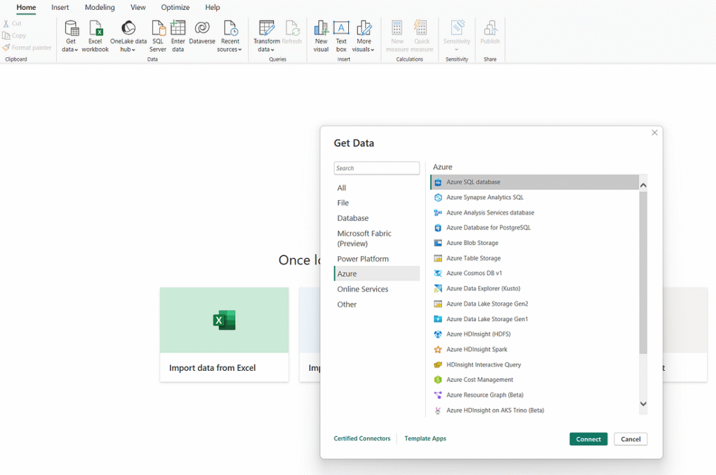
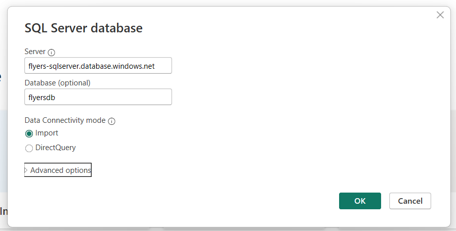
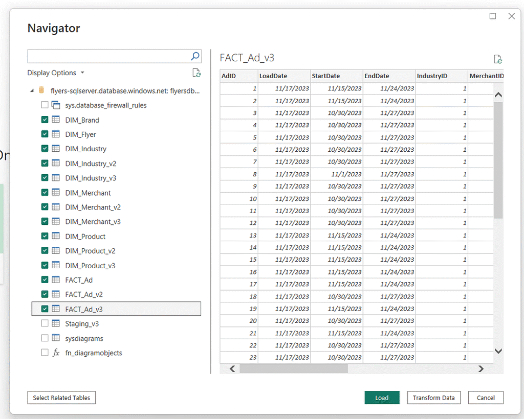
The first step in working with data in Power BI is connecting to the data source. This is accomplished through the ‘Get Data’ icon on the ribbon. We are connecting to an Azure SQL Database, so navigate to the Azure tab and select Azure SQL database. Provide the server and database names, and keep the connectivity mode set to import. Grant Power BI access via SQL authentication, and then select the relevant tables you want to load (all the dim and fact tables). Don’t worry about transforming the data at this point. We have already done essentially all of our transformations directly in ADF, and we can perform the remainder later within the Power Query Editor. Click the ‘load’ button to load the tables and enter the Power Query Editor.
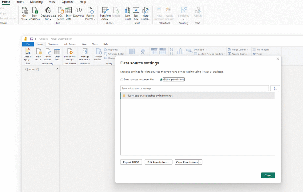
If you incorrectly enter your authentication information, you may need to delete the connection, as Power BI saves data connections. To do this, access the Power Query editor by clicking the ‘Transform Data’ icon in the ribbon and then ‘Data Source Settings.’ This allows highlighting the relevant connection, clearing the permissions, and forcing Power BI to prompt for credentials again when recreating the connection.
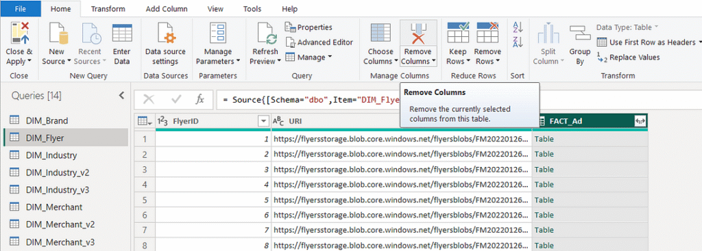
As of writing this article, Power BI brings tables in with an additional column linking to tables that have a foreign key. Remove these columns from each table in Power Query Editor by highlighting and clicking ‘Remove Column’ on the ribbon. You can also delete them by right-clicking on the column itself. Repeat this process for every table, removing the foreign key columns. Our fact tables have multiple foreign keys, meaning they have multiple columns to remove. After removing unnecessary columns, click ‘Close & Apply’ to load the data into Power BI for further work in the main Power BI views.
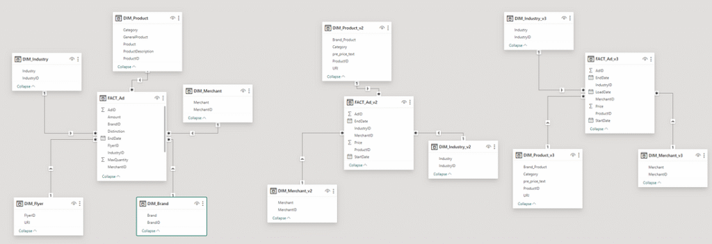
The far left shows three icons that let you navigate between model view, table view, and report view. The ‘Model View’ shows you that Power BI has already identified and applied all the primary/foreign key relationships and displays star schemas for each version of our project. By default, each relationship is a one-to-many single direction relationship with the dimension tables filtering the fact table. We will not make any changes to the relationships at this point.
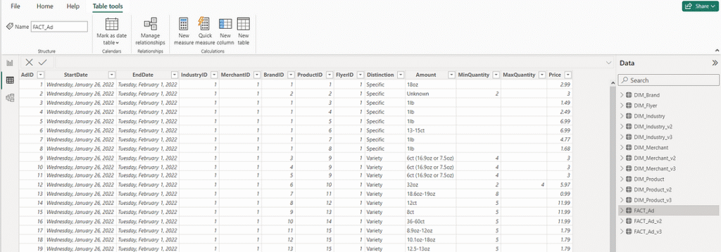
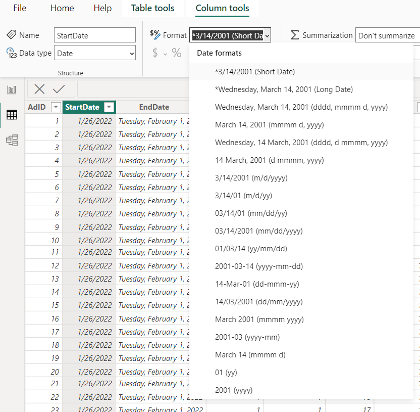
The ‘Table View’ allows viewing data within tables. This is where calculated columns and values can be built. In the DIM_Flyers table, specify that the ‘URI’ attribute is of data category ‘Web URL’. We also have three fact tables that each contain dates. These dates default to a lengthier format that don’t look good in visuals, so let’s find them and change the format from ‘Long Date’ to ‘Short Date’.
Visuals
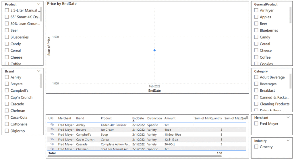
At this point, we are ready to build some visuals. For v1, I only created three types of visuals: Slicers, Line Charts, and Tables. For the second and third versions, I added a custom visual called ‘Simple Image,’ which can be obtained through the AppSource (by clicking the ellipsis on the visualizations pane). Note that to obtain custom visuals via AppSource, you will need to be logged in. I won’t cover each visual I created. Instead, I’ll briefly walk through the creation of each type.
Slicers
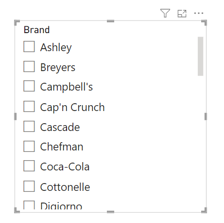
Slicers allow a user to filter other visuals on a report by an attribute. Let’s create a slicer to filter our report by brand. In the Visualizations pane, find and click the slicer icon.
This will bring up a blank slicer visual. On the far right in the Data pane, find your DIM_Brand table and then click the checkbox for ‘Brand’. This is really all that is needed to create a slicer. You can play around with the format (change the title, add a border) in the Visualizations pane and move or resize the visual on the report as you please. As long as the filter direction (which we can find in the Model View) is set correctly, slicers will allow us to filter other data on a report. There are even options to allow slicers to filter content on different reports within the same file by using the Sync slicers feature.
Tables
Table visuals are just as you would expect. It allows you to select a set of related attributes and display them in a table on your report. Let’s create a table to display interesting attributes about our advertisements. In the Visualizations pane, find and click the table icon.
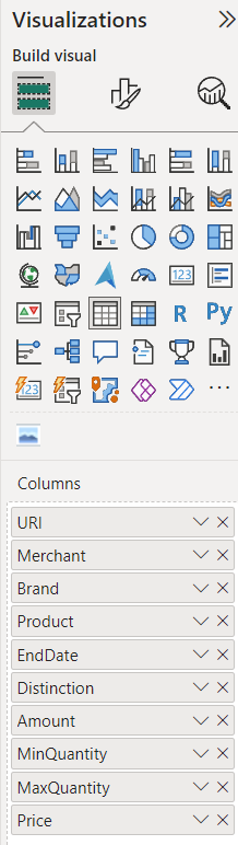
This will bring up a blank table visual. In the Data pane, find and add the following attributes.
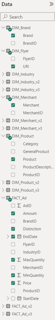
You can then order and rename the attributes as seen below. This can be done by dragging and dropping them, and editing the names through the dropdown menu for each attribute. Power BI will often try to be helpful and assume you want dates as a date hierarchy. In this case, since it’s only an attribute in a table, we want it to simply display the date itself rather than broken down into a hierarchy. This can be changed in its dropdown menu.
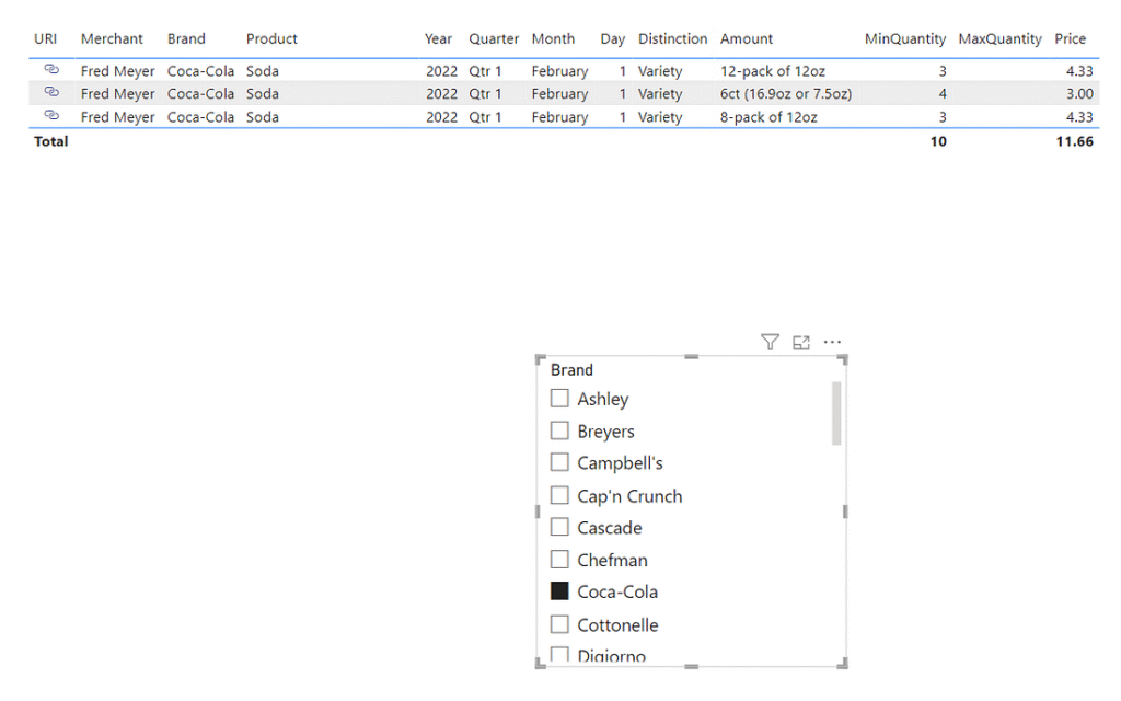
You will now have a lot of data displayed in your table visual, and you’ll notice there is a lot of space being taken up by the ‘URI’ attribute. Let’s make use of that data categorization change we made earlier to make this link appear as a small icon. In the Visualizations pane, navigate to the ‘Format your visual’ tab near the top, and under ‘URL icon,’ turn the radio button on. This will make our table look much neater. You’ll also notice that you can select a brand using the slicer, and your new table will filter to only advertisements related to that brand.
As with the filter, you can play around with the format (change the title, add a border) in the Visualizations pane and move or resize the visual on the report as you please. Tables are great visuals for users who are engineers, data analysts, business analysts, or anyone else who might need to dig deep into the data to access detailed information.
Line Charts
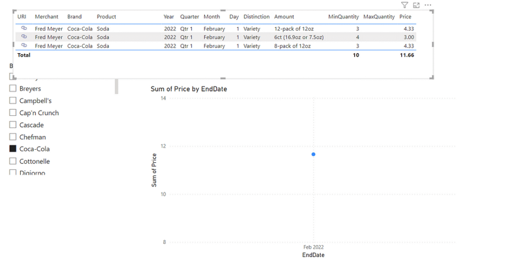
Line charts are a great visual to show trends over time. You will likely need to put some extra thought into what story you are trying to tell as you build line charts, but they are a powerful and commonly used tool. We will continue with the v1 data to build a line chart even though we only have a single day’s worth of data to work with. You will have to use your imagination or open the report from GitHub with v3 data to see how it looks with multiple time periods of advertisements. In the Visualizations pane, find and click the line chart icon.
This will bring up a blank line chart visual. In the Data pane, find and add ‘EndDate’ and ‘Price’ from the FACT_Ad table. Power BI will automatically assume you want the date attribute on the X-axis and the price on the Y-Axis. As before, you’ll once again need to tell it to not use a date hierarchy. Price will default to a sum as Power BI needs a way to aggregate the data. For this example, let’s leave it at sum. This means it will add up each advertisement’s price for whatever filter we have set and display that sum on the line chart. You could format the visual to give it a nicer title if you want. You now have a line chart that will display the sum of prices for your selections. These prices will be filtered by both the slicer and/or individual rows selected in our table visual.
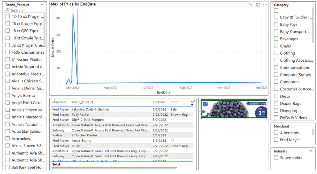
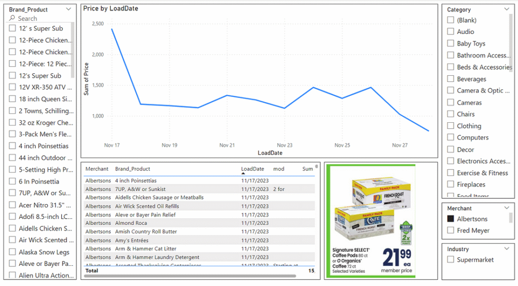
Custom Visuals
Custom visuals are visuals created by organizations or individuals that can be used in addition to the visuals made available out of the box. To make use of custom visuals, you’ll need to be able to log in to Power BI. For this report (specifically v2 and v3), I make use of a custom visual called Simple Image.
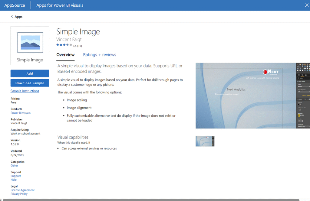
This visual takes the URL of an image and displays it while scaling to your preferred dimensions. To make use of this visual, you’ll need to click the ellipses under the Visualizations pane and search for “Simple Image” and then click the ‘Add’ button. You can then use this visual in your report and simply use the ‘URI’ attribute in the DIM_Product table of either v2 or v3. This will then display the image of the specified ad based on what is filtered.
Putting the Visuals Together
The final result of these visuals can be seen below for v1, v2, and v3 respectively.